
Download a Copy of the
““Better Together” Poster”
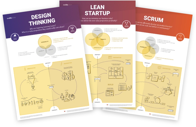
What it is
The co:dify version of three teaching and reflection posters, which were developed by Markus Andrezak, Holger Rhinow, Anne Greuling, Abraham Taherivand, and Jan Schmiedgen for HPI Academy’s “From Design Thinking to Agile Development” course (a heavily recommended learning experience by the way). We created them to make learners aware of the similarities, differences and interrelations of Design Thinking, Lean Startup and agile software development with Scrum.
For Whom it is
The posters are primarily made for introducing people new to agile product development to the basic concepts of (double loop) learning in fast iterative cycles. They therefore can be used by trainers, workshop facilitators, innovation catalysts, (internal) consultants, and any other groups which have to reflect upon the latter in a didactic way.
How To use it
You can use them as a “progress bar” during your learning experience, to show where people are in the process. But they unfold their real benefits in the reflective parts of your training: here you can discuss the neuralgic points you experienced while progressing your work and you can also use them to visualize for example innovation barriers, inflection points, (new or altered) decision-making gates, etc. Holger Rhinow wrote a series of Medium articles on them too. This might also be a good starting point.
Best used with
Complement them with whatever is useful for you. We usually use stickies to add participants thoughts and critical moments (e.g. the Throwaway MVP moment) to the posters. But also method cards, innovation barrier cards, and any other dimension you might have to discuss can be added to them.
Fun Fact
We at co:dify (and also the community at the HPI) experimented with lot’s of different versions of such posters for our teaching over the years (for example this one, where we used the SAP design process visualization by Laurent Pollefoort and complemented it with our own dimensions and examples to explain what’s behind it ). We also tried the popular loops-of-loops versions. Yet it turned out, they all were too complex and too linear in visualization. The three posters above are the most simplified essence we could come up with and we are quite satisfied with it now for our purposes. We are happy if they are useful for you too.